

Flexbox is amazing. It has changed how we write the CSS and it provides built-in support for responsiveness. So all the responsiveness of your website is handled by flexbox making it easier to create websites.
Flex Axes and General Layout
Like in any other grid-based design layout, we have to think of Flexbox in terms of axes, which would form the basic structure or skeleton of our user interface. And, as I had mentioned earlier, flex elements can be laid out in rows or columns; so, there are two axes: the main axis and the cross axis. On these axes would then reside the flex container, which is the parent element or general area laid out using flexbox. Inside the flex container would be the flex items, which are the child items or rather the content of the container (text, images, anything). These flex items can then be moved around within the container depending on what we need.
Here's what a flexbox layout might look like:
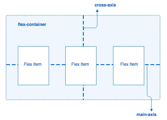
Due to the aforementioned 1D characteristic of flexbox, flex items can be placed either horizontally (row) or vertically (column). The axis along which the flex items are placed would be our main axis, whereas the one perpendicular to it would be the cross axis. Since our items are placed in a row in the illustration above, then the horizontal axis is the main axis.
Let's get started
Flexbox allows the elements on the page to grow and shrink based on the device width so we don’t need to write much CSS code to handle responsiveness.
To use Flexbox, the first thing you need to define is a flex container with the display: flex property.
Take a look at the below layout:
As we know, a div is a block element so each div is displayed on a separate line.
Here, the main div is the container that holds the other div. So we need to add the display: flex property to the parent main div container.
As you can see above, Just adding display: flex makes the child elements display side by side. Let’s look at the properties available for the main container which holds the child elements.
flex-direction
By default, the direction in which elements are displayed is a row so the below code:
.list {
  margin: 5px;
  padding: 5px;
  background-color: orange;
  display: flex;
}
is same as
.list {
  margin: 5px;
  padding: 5px;
  background-color: orange;
  display: flex;
  flex-direction: row;
}
The flex-direction property takes one of the following values.
row:This is the default value forflex-direction, so when we don’t specify anyflex-direction, it will berowby default.
row-reverse: It displays child elements in reverse order side by side.
column: It displays child elements one below the other.
column-reverse: It displays child elements in reverse order one below the other.
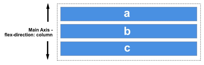
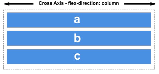
One thing to keep in mind is that, In Flexbox, how the elements are displayed is defined by the main axis or cross axis.
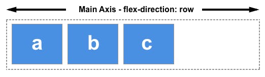
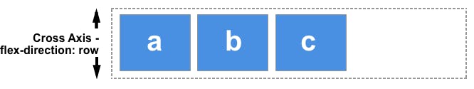
Whenever we define flex-direction as row or row-reverse, the main axis runs horizontally and the cross axis runs vertically.
and when we define flex-direction as column or column-reverse, the main axis runs vertically and the cross axis runs horizontally.
justify-content
justify-content defines where the elements will be displayed on the main axis.
When we don’t specify the flex-direction, it means it’s considered as row by default so the main axis is horizontal here.
The justify-content property takes the following values.
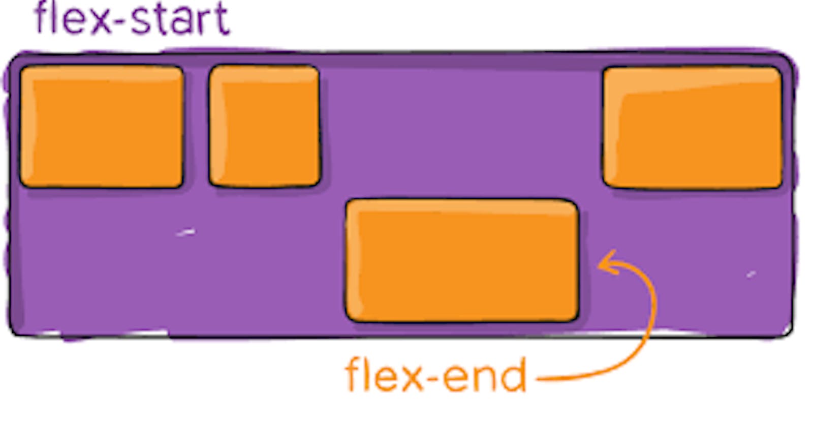
flex-start: This is the default value forjustify-content. So when we don’t specify this property, thejustify-contentvalue will beflex-start.
flex-end: It displays elements at the end of the main axis.
center: It displays the elements in the center of the main axis. This property value is mostly used when we need to center content horizontally.
space-between: It will equally distribute the space between the middle elements except for the first and last element. This is the most widely used property value as compared to others.
space-around: This will distribute the equal amount of space to the right and left of each element except the first and last element. For middle elements, space is twice when compared to the first or last element.
So if each element has 10% space on right and left respectively then number 2 will have 20% space on the left because number 1 has 10% space on right and number 2 has 10% space on the left so making it 10 + 10 = 20%. Similarly, on the right of number 2, space will also be 20%. Whereas the left side of number 1 and the right side of number 3 will have 10% space.
space-evenly: This will equally distribute the space between each element. So every element will have equal space on the left and right sides.
Even though we are resizing the browser window, the elements do not go out of the window or do not add a scrollbar but they will adjust to the width of the device or web page.
So we don’t need to add a lot of extra code to make it responsive if we use Flexbox.
align-items
This property is used to align items across the cross axis.
The align-items property takes the following values.
stretch: This is the default value so if we don’t specify this property, thealign-itemsvalue will bestretch. It stretches the height of each element to be equal to the height of the tallest element.
As you can see here, we have not specified the flex-direction, so the main axis is horizontal and the cross axis is vertical so even if we have specified the height of number 2 to be 250px but because of the default stretch value, all elements will have an equal height which is 250px and all the elements are stretched vertically.
As you can see here, we have specified the flex-direction as a column so the main axis is vertical and cross axis is horizontal and the align-items property is used to align the items across the cross axis, the elements are stretched horizontally.
flex-start: This will display the elements at the start of the area.
flex-end: This will display the elements at the end of the area.
center: It displays the elements in the center of the main axis. This property value is mostly used when we need to center content horizontally.
As you can see the elements are centered vertically because the cross axis is vertical.
As you can see the elements are centered horizontally because the cross axis is horizontal.
All the above flex properties like display, flex-direction, justify-content, and align-items are added to the container which holds the child elements.
Now we will see the flex properties which are used for each flex element.
flex-wrap
The flex-wrap property allows us to move elements to the next row if it does not fit on the current row.
Take a look at the below layout which does not use the flex-wrap property.
Now take a look at the below layout which uses the flex-wrap property.
order
The order property allows us to change the order of elements displayed in the flex container. The default order value is zero.
The element with the lowest order will be displayed on the left side and the element with the highest order will be displayed on the right side. The elements which do not have any order defined will have an order of zero.
Take a look at the below layout:
As can be seen in the above demo, an element with class first has order 3, and an element with the class third has order -2, the other elements will have order 0 so the highest order element will be displayed on right and the lowest order element will be displayed on left.
Adding order allows us to change the position of displayed elements on smaller-width devices like mobile phones.
flex-grow
This property defines how the element will grow in relation to other elements. The default value of flex-grow is zero.
Take a look at the below layout:
As you can see, setting flex-grow to 1 for each element will allow that element to take the entire width that element has.
Let’s take a look at the below layout now:
As you can see, the first element has a flex-grow of value 3 so it will grow 3 times compared to others.
And that’s pretty much it. 🙂
I hope this reference guide has been helpful for you!
Thanks to:- Hitesh Chaudhary